Olde Mecklenburg Brewery
Heritage and space
German-style beer brewed under the 1516 purity law, and what's billed as the Southeast's largest beer garden, on 8.5 acres.
Case study · Brand identity · 0 to 1
How a tiny, woman-founded brewery got noticed in a city full of breweries
Charlotte had dozens of breweries. Pilot was a new, woman-founded nano-brewery in a small space, making small batches, up against more established breweries for the same drinkers.
It couldn't win on size, so it had to win on memory. The brand needed to make people notice a can on a crowded shelf, look twice at a building on the street, and come back. It had to work at every size, from a social post to the side of the building, and keep working as the beer list grew.
I worked directly with the client to set three goals for the brand:
Charlotte's biggest breweries sell a place. Pilot, at 1,900 square feet, couldn't, so it had to sell a personality and a ritual.
Olde Mecklenburg Brewery
German-style beer brewed under the 1516 purity law, and what's billed as the Southeast's largest beer garden, on 8.5 acres.
Sycamore Brewing
"Charlotte's largest independent brewery," with a huge South End beer garden, live music and distribution across six states.
Pilot Brewing
Curious, nerdy and playful, built around weekly trivia, small experimental batches and a woman-founded story. Small enough to know your name, and impossible to forget.
Competitor profiles from public sources: Axios, Islands, Brewbound.
I built the brand as a world instead of a logo. Aviators, quirky birds, science nerds, little icons and small nuances gave every surface something to discover, and gave the brewery a cast of characters it could keep using. A big brewery can buy attention. A small one has to be impossible to forget.
The aviation theme came straight from the name. The hard part was the tone. I first explored a quirky, surreal direction inspired by Ralph Steadman, but it didn't match who the brewery really was: a nerdy, trivia-loving, science-minded crowd. Weekly trivia was one of the taproom's biggest draws, so I leaned in, adding the beer nerds and science details that made the brand feel like an inside joke regulars were in on.
The founders' story was part of the positioning too: a woman-founded brewery making its own way in a crowded, traditionally male industry.
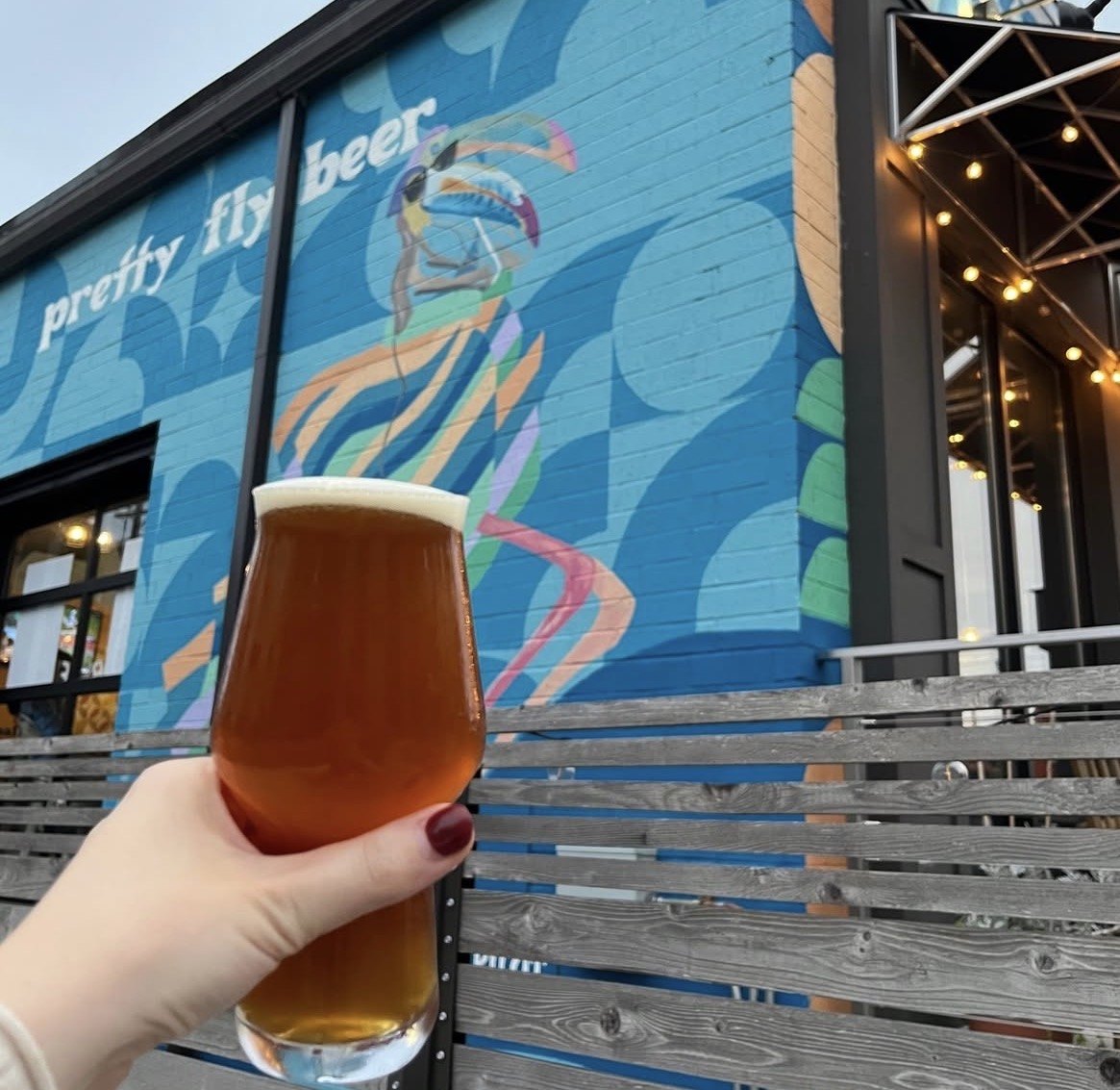
pretty fly beer
Aviators, quirky birds and science nerds.
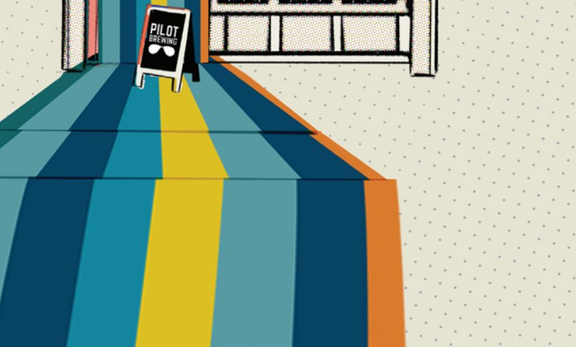
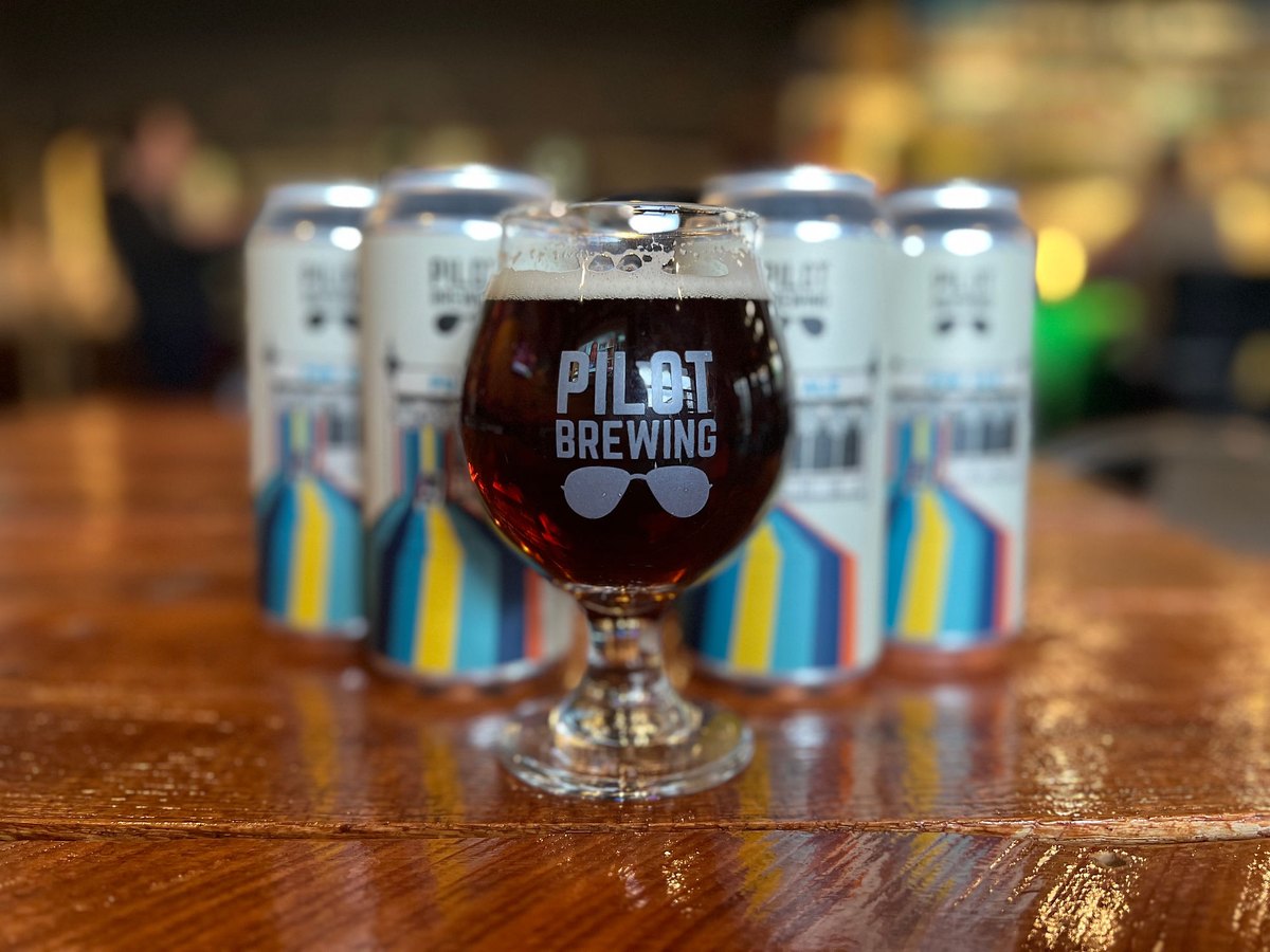
A brand guide in one view: the mark, the voice, the palette, the illustration style, pattern, and the brand at the size of a glass and the size of a building.
I built it as a design system, not a set of one-offs. Every new beer could plug into the same characters, patterns and templates, so the social media manager and future designers could keep the brand consistent without starting from scratch.
My labels set the direction that later designers followed after I left the agency. The system was built to be extended by other people, and it was.
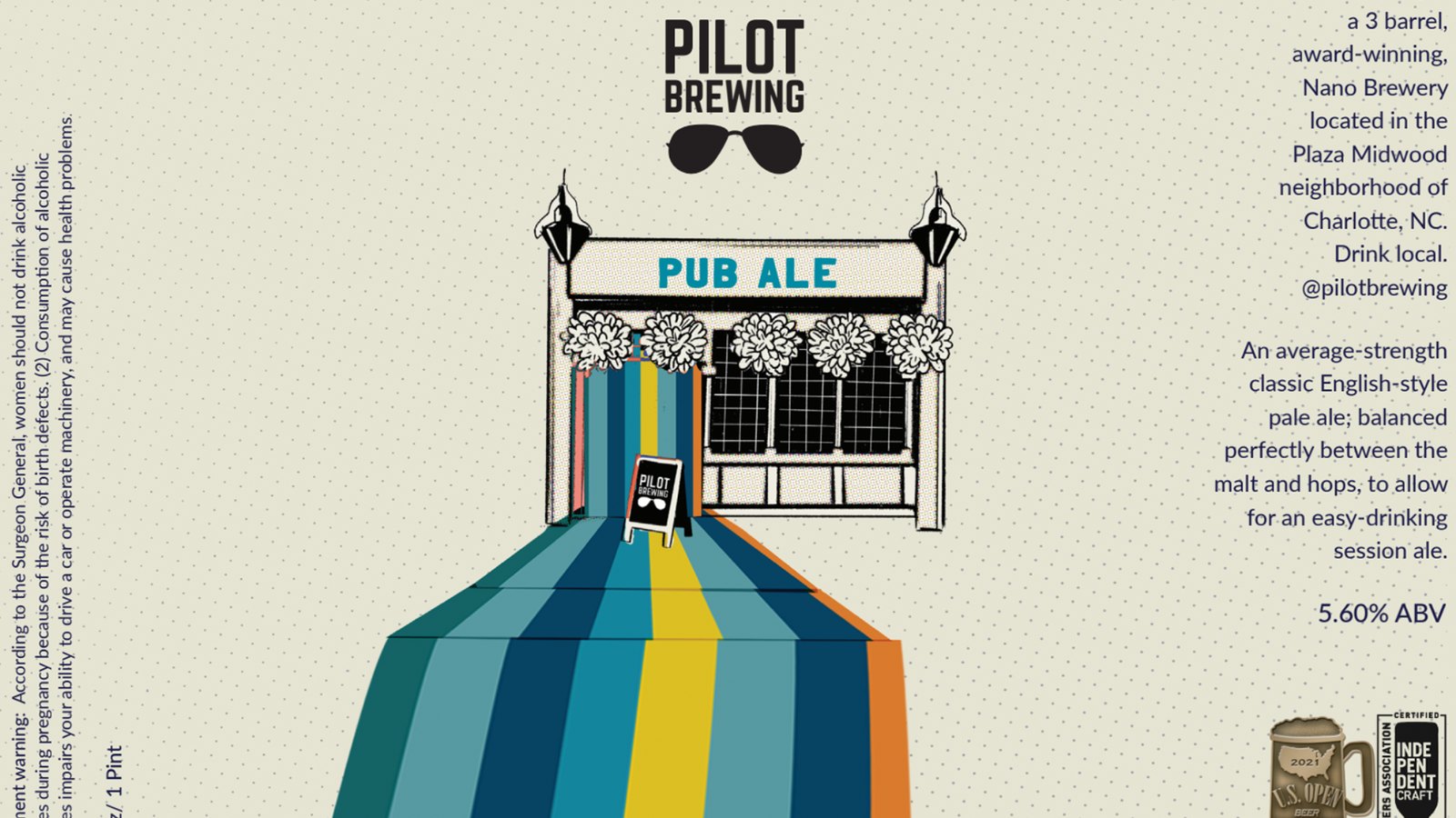
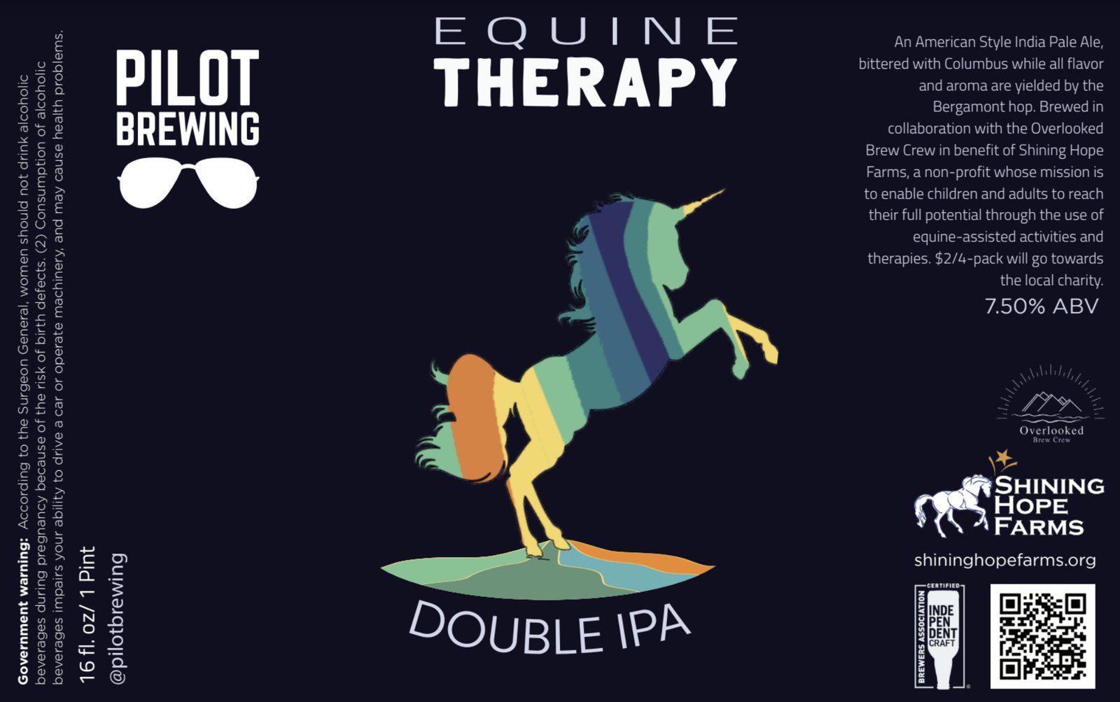
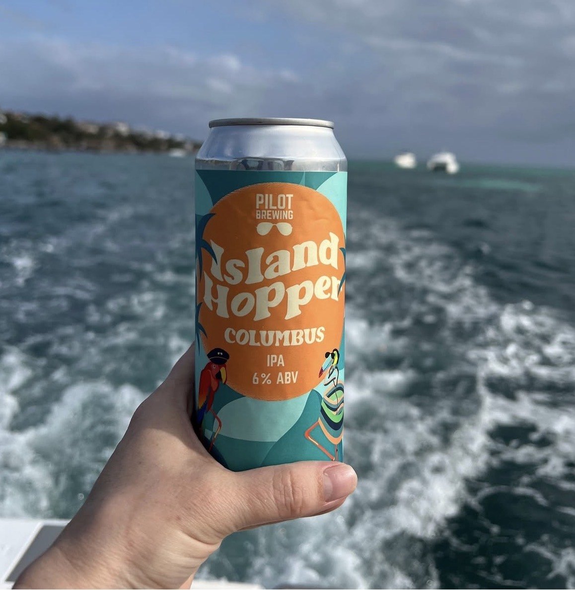
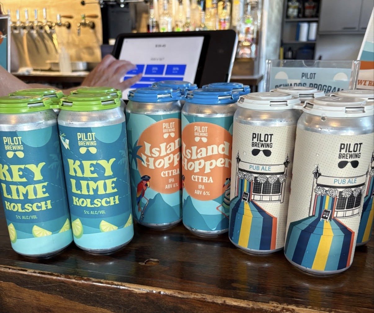
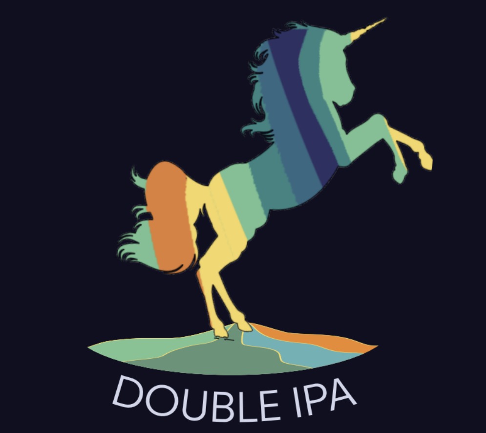
Labels and cans from the Pilot brand system. I designed the original labels; later designers built on that direction.
The brewery also partnered on collaborations with charities working on social justice and environmental causes.
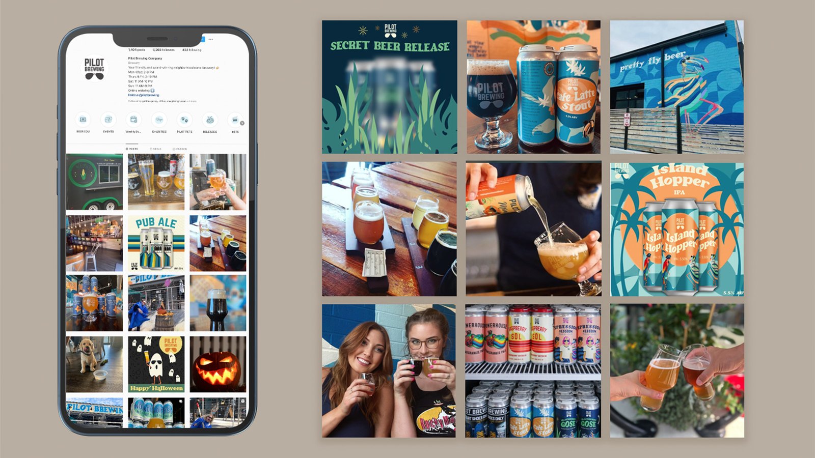
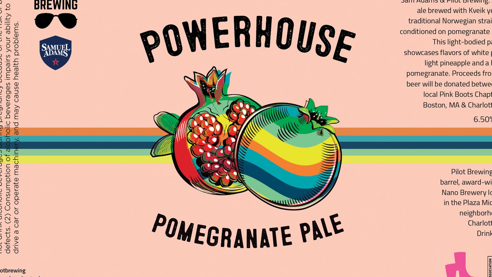
The social system, and the Powerhouse Pomegranate Pale collaboration can, which I designed.
Results as observed working with the client; no public figures.
A small brewery got a brand big enough to compete for attention in a crowded beer city. And it's creative direction that outlasted my time on it: a world clear enough that other designers could pick it up and keep going.