For clients
Too much work to look good
Banks needed flexible, easy-to-use website tools. The product took too much effort to get a polished result without a creative team on staff.
Case study · Brand systems & product
Regional brand systems for community banks
In six months
326%
growth in recurring revenue from annual hosting fees after launch
June to December 2023. Business results, shaped by sales and pricing as well as design.
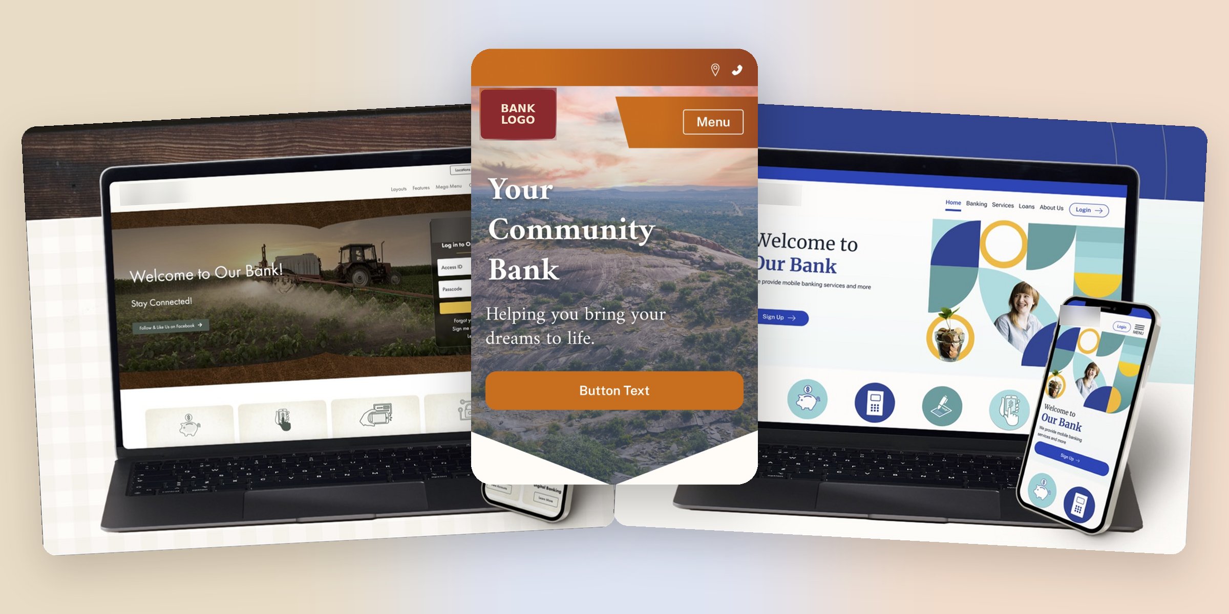
Small and mid-sized banks used the product to build and run their own websites. Growth had stalled and clients were leaving.
For clients
Banks needed flexible, easy-to-use website tools. The product took too much effort to get a polished result without a creative team on staff.
For the business
An outdated self-serve experience made the product harder to adopt and easier to leave, and renewals were holding back growth.
The insight
For non-technical clients deciding whether to keep paying, how easy it was to use shaped how much they thought it was worth.
I went to the banks paying for the product and to the sales team trying to sell it.
Client interviews
Banks told us the templates didn't fit their community or their customers. A farm lender and a city bank were being handed the same look.
Sales tickets
Requests and objections from sales pointed to the same gap: banks wanted a site that matched their region and identity, and the generic templates got in the way.
Who edits the site
The people updating these sites were bank staff, often not tech-savvy, with no creative team to lean on. Anything that looked complicated didn't get used.
So the job was two things at once: make it look like their bank, and make it easy enough that anyone on staff could keep it that way.
The solution
A community bank's website is its storefront, so I treated churn as a brand problem, not just a usability one. I designed a range of 10 styles. The regional ones take their cues from how banks in each part of the country already show up: their customers, their landscape, their local look.
The full range, all designed by me
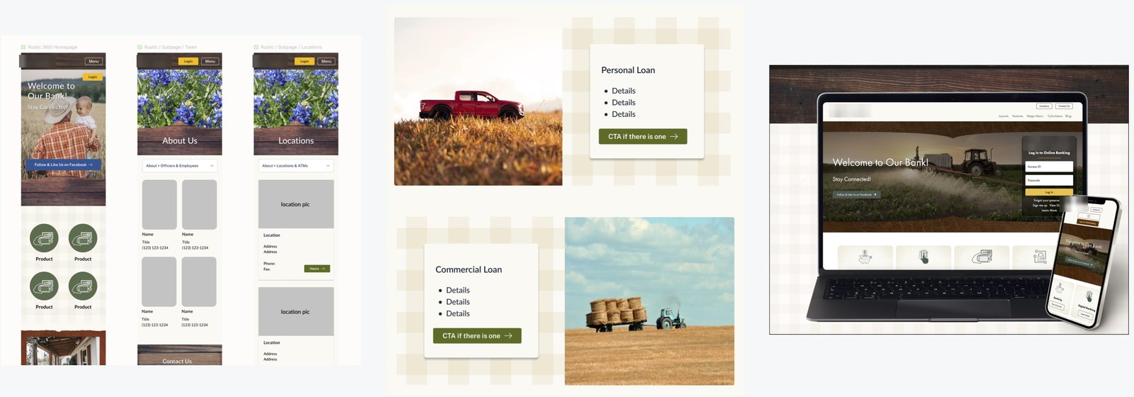
Farm country
Conservative patterns, warm earth tones and familiar stock imagery for institutions rooted in agriculture.
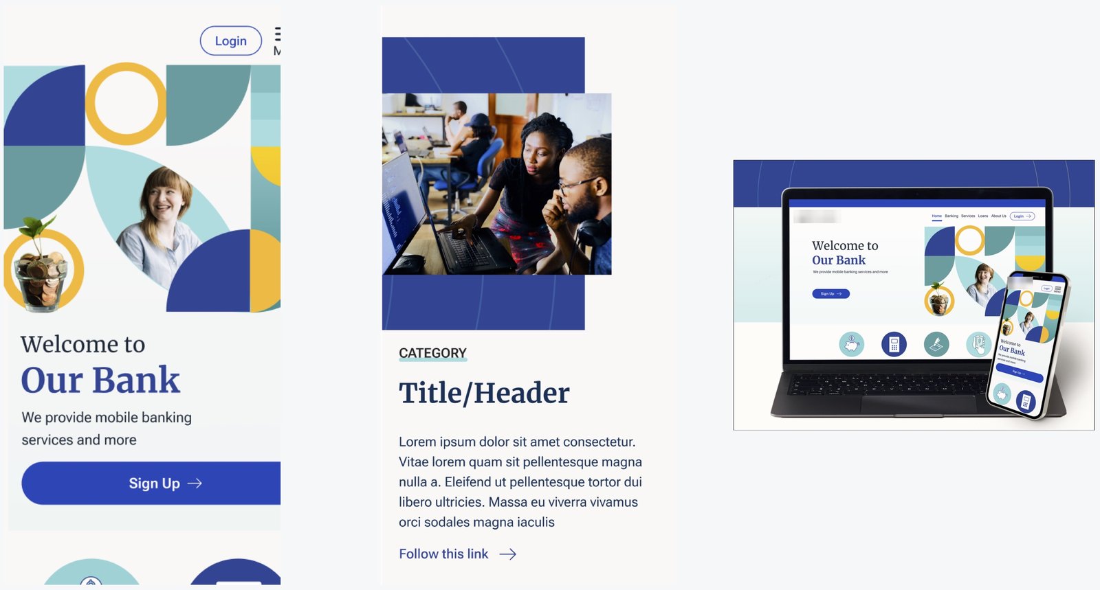
East Coast
Bolder color, geometric shapes and subtle curves for banks that want to look modern and expressive.
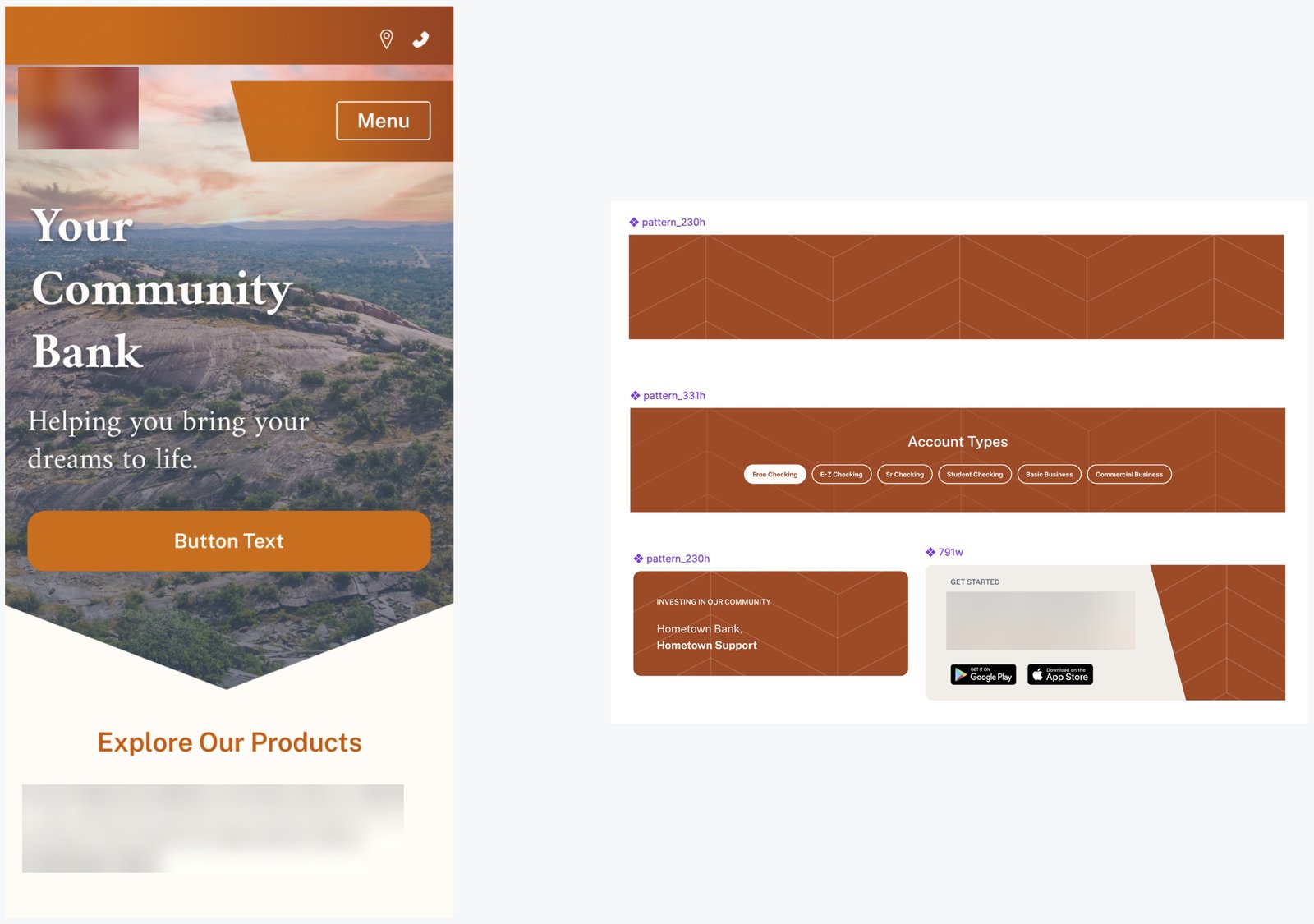
Mountain West
Warmer colors and pointed forms that echo the landscape, with a pattern system that carries across sections.
All 10 styles, designed by me, from farm-country warm to clean and minimal, each built on the same set of components.
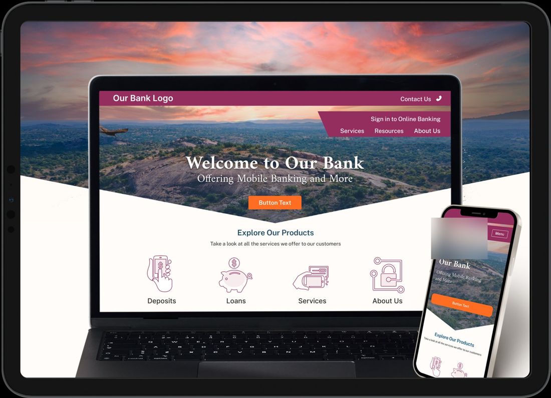
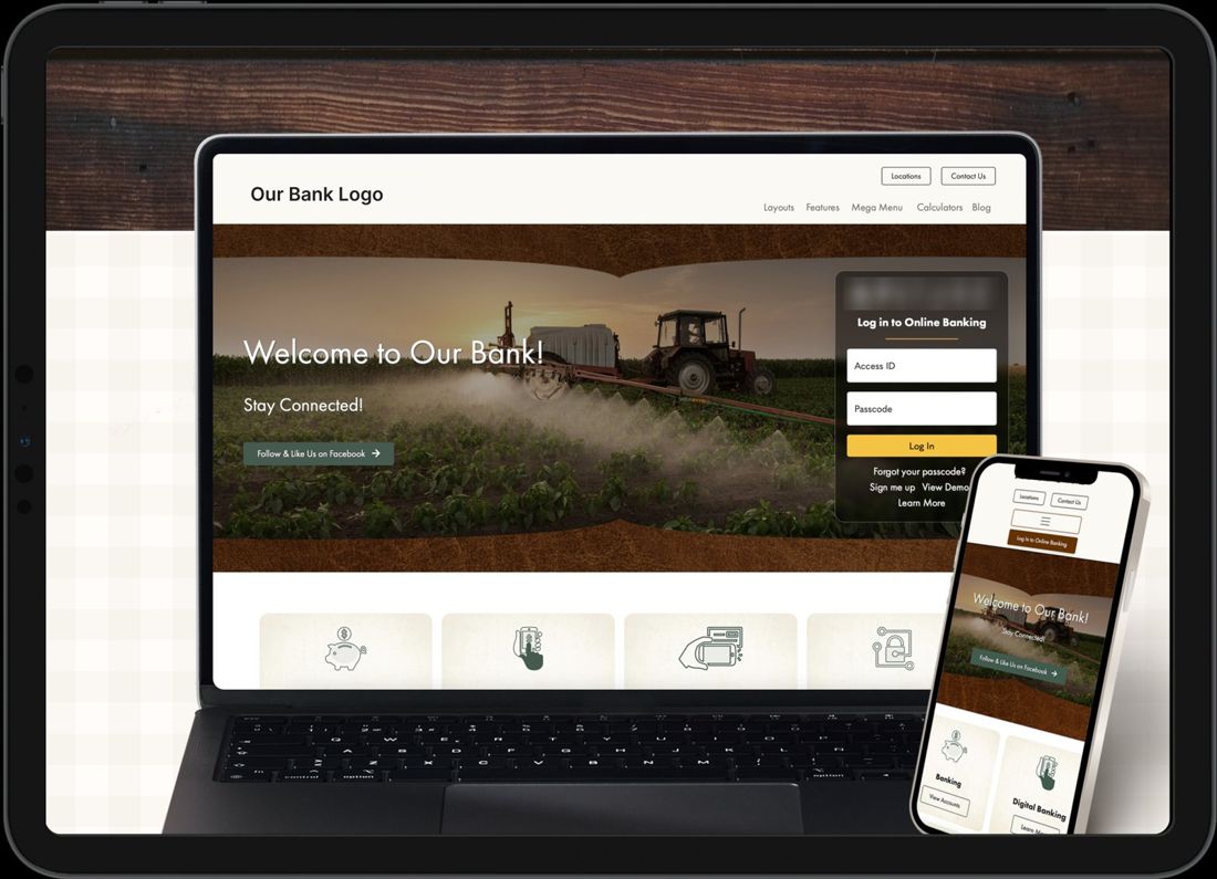
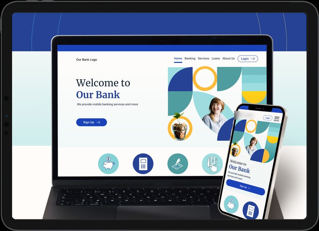
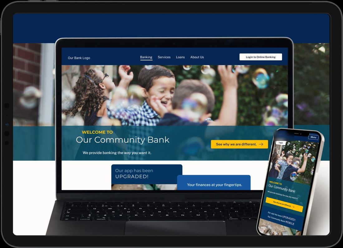
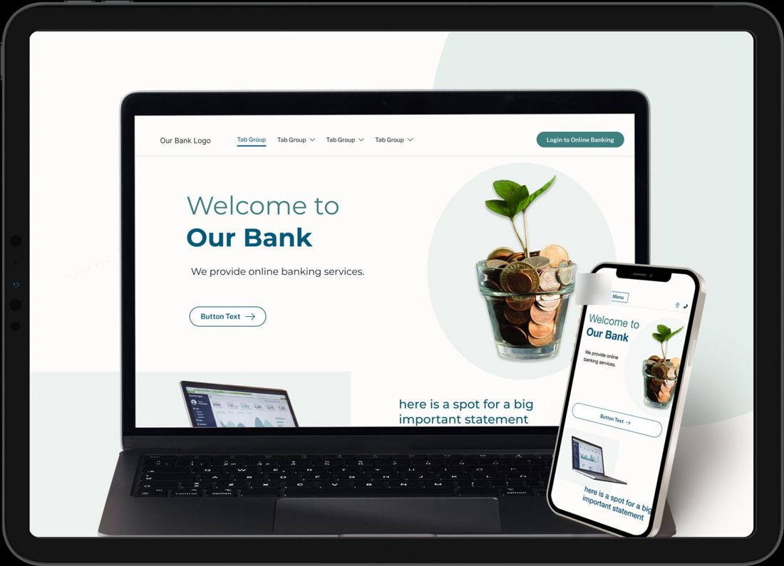
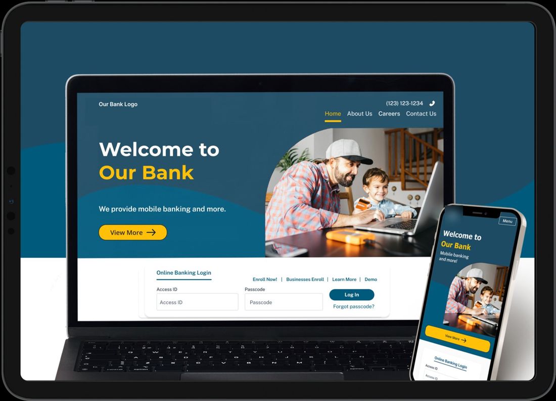
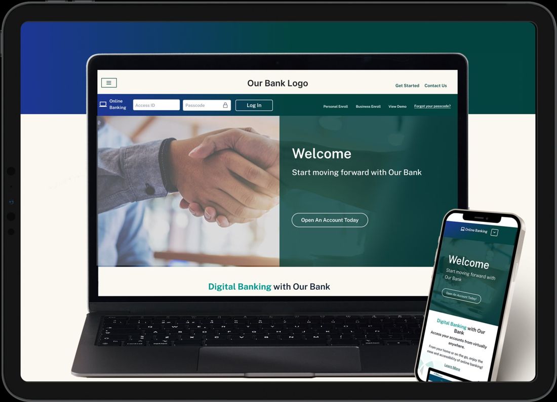
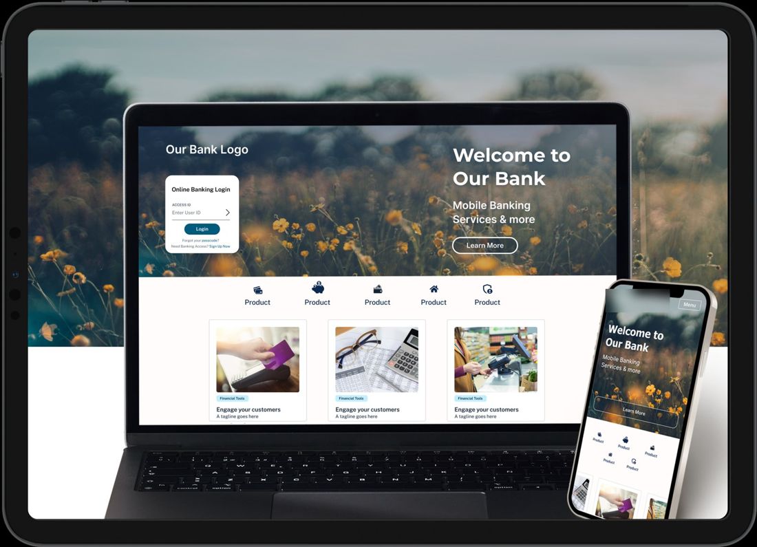
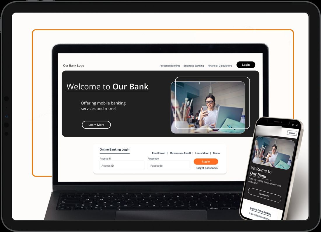
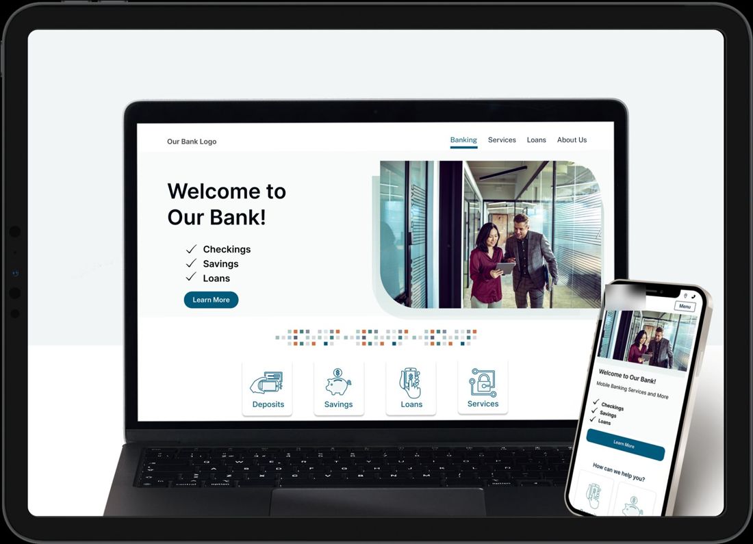
Shown with placeholder content.
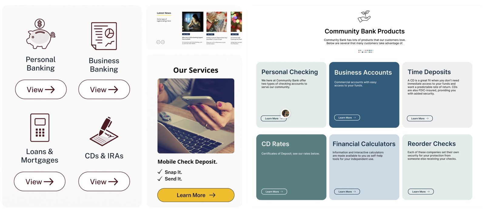
Each style is a skin, not a separate product. The building blocks banks actually need, like product cards, services, news, rates, calculators and branch locations, were designed once and restyled for each template. That kept the range cheap to grow and easy for clients to edit, whichever style they picked.
Banks took the templates and made them their own, with their own photography, colors and voice, without needing a designer. Farm lenders, ranch-country banks, small-town and city banks, all on the same system.
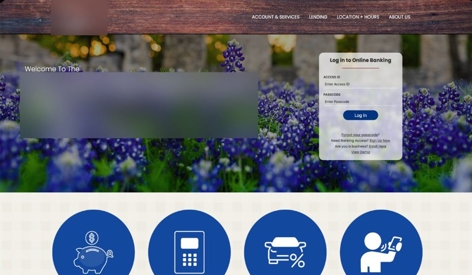
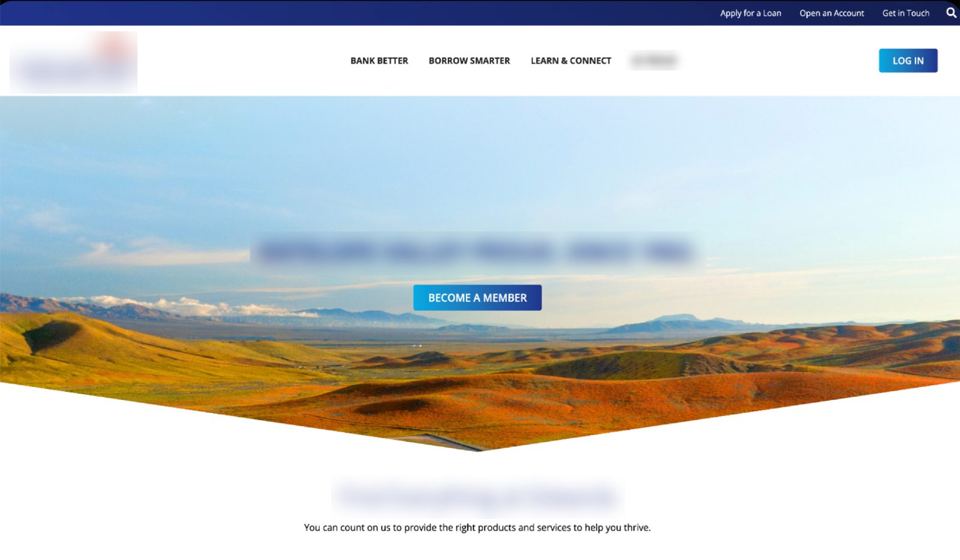
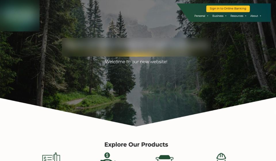
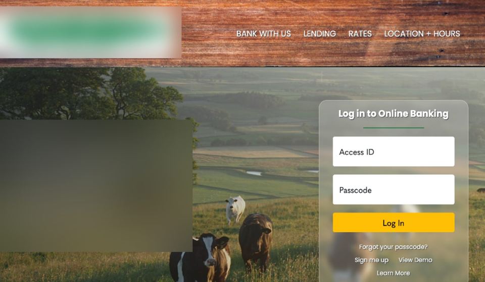
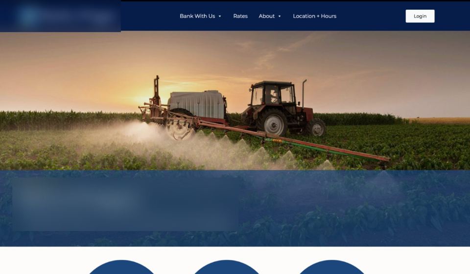
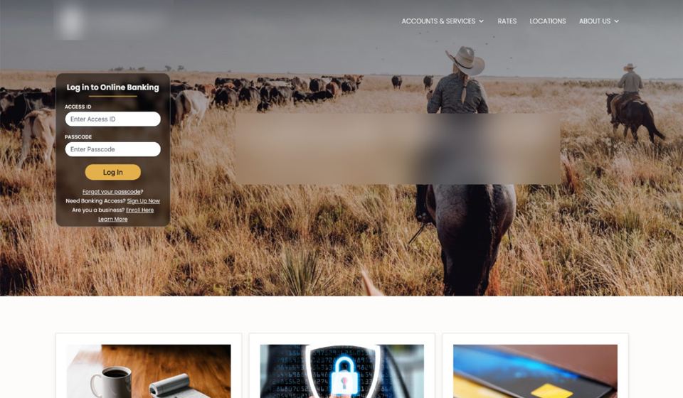
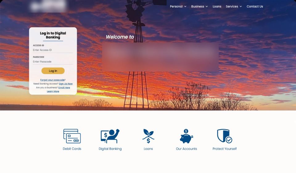
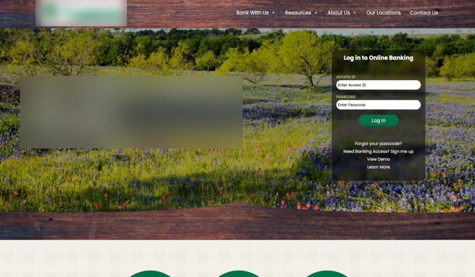
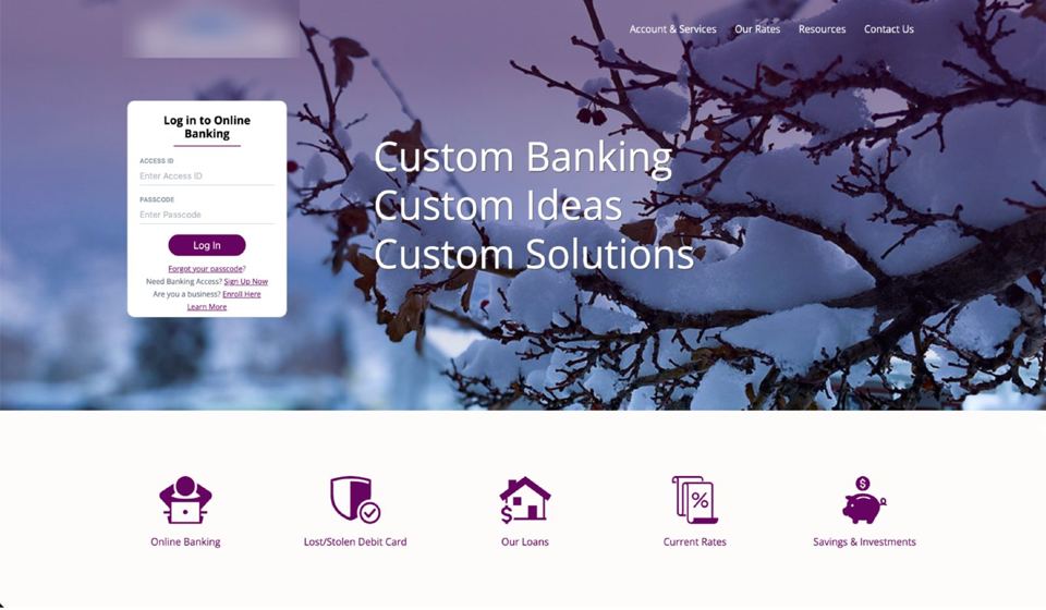
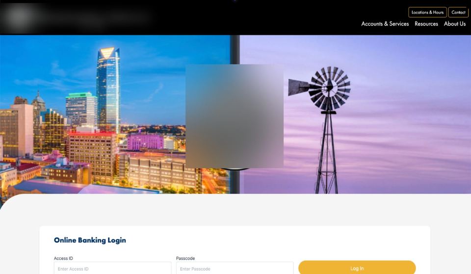
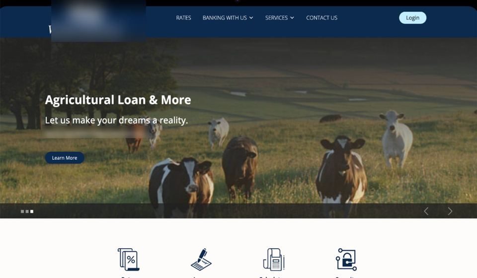
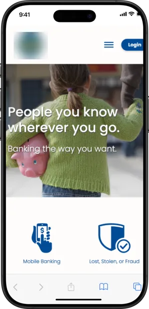

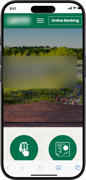
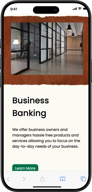
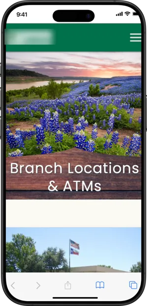
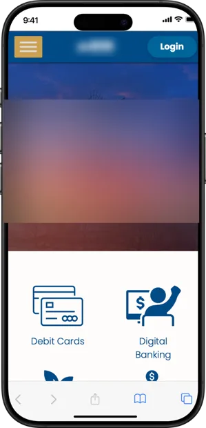
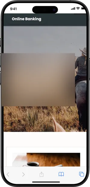
A sample of client sites. Bank names, logos and local details are blurred for privacy.
The regional template idea was mine, along with the overall approach. I worked with a product manager, engineering, marketing and client stakeholders.
It's brand work with a business number attached: a template range shaped by regional identity, inside a product clients were deciding whether to keep paying for.